When I first created my personal blog, I saw "thisaway rose" template created by Dan Rubin; it spoke to me. The template has a mixture of different pinks on the margins and a cool, deep, yet vivid purple for the header and font color. "Thisaway Rose" Emphasises the pictures I post, making them pop out to the viewer. Though I love this template, I want to see what would happen if I actually change to a different one, would my blog still have the same impact?
Alternative Template 1: Mr. Moto created by Jeffrey Zeldman
*At first when I looked at this template the word that came to mind was dull. But as I looked deeper, I realized that the gray margins and header gave my blog a quiet strength. It brings out the colors in my video clips and photos; as well as heightens the intensity of my black and white drawings. Though the down side of this template is the fact that if this wasn't my blog I might by pass it. I would only consider reading the blog, because of its header: The Crow Speaks Her Own Truth.

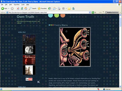
Alternative Template 2: Dark Dots created by Douglas Bowan
* This template is too busy and all over the place. It clashes harshly with my images; which means that my viewers would spend most of there attention on the dots and not my text, that seems to disappear inside the dark blue background.

By experimenting with two different templates has allowed me to see that a blog depends on the style its framed in. "Thisaway Rose" fits my blog perfectly to me, it expresses my personality: sweet, intuitive, and determined. Though if my template wasn't available I would have to go with "Mr. Moto" that creates a bit of mystery, which is what I want my writing to convey.
Another well-considered response...
ReplyDelete